
This guide explains how to interpret chart timeframes by focusing on meaning, participation, and context — not prediction, indicators, or trading signals.
📌 In This Guide
- What a Timeframe Actually Is
- Timeframes Are Participation Lenses
- Noise vs Structure: The Most Common Confusion
- Why Higher Timeframes Often Carry More Weight
- Same Chart, Different Stories
- The Multi-Timeframe Habit (Without Signal-Chasing)
- Timeframes + Scale + Volume: The Context Trio
- Common Timeframe Mistakes
- A Simple Checklist Before You Interpret Any Chart
- Conclusion: Timeframes as Orientation Tools
What a Timeframe Actually Is
A timeframe is not a style choice. It is a compression setting that determines how much market activity is bundled into each candlestick.
On a one-minute chart, one candle represents sixty seconds of transactions. On a daily chart, one candle represents an entire trading session. On a weekly chart, one candle represents multiple days of negotiation.
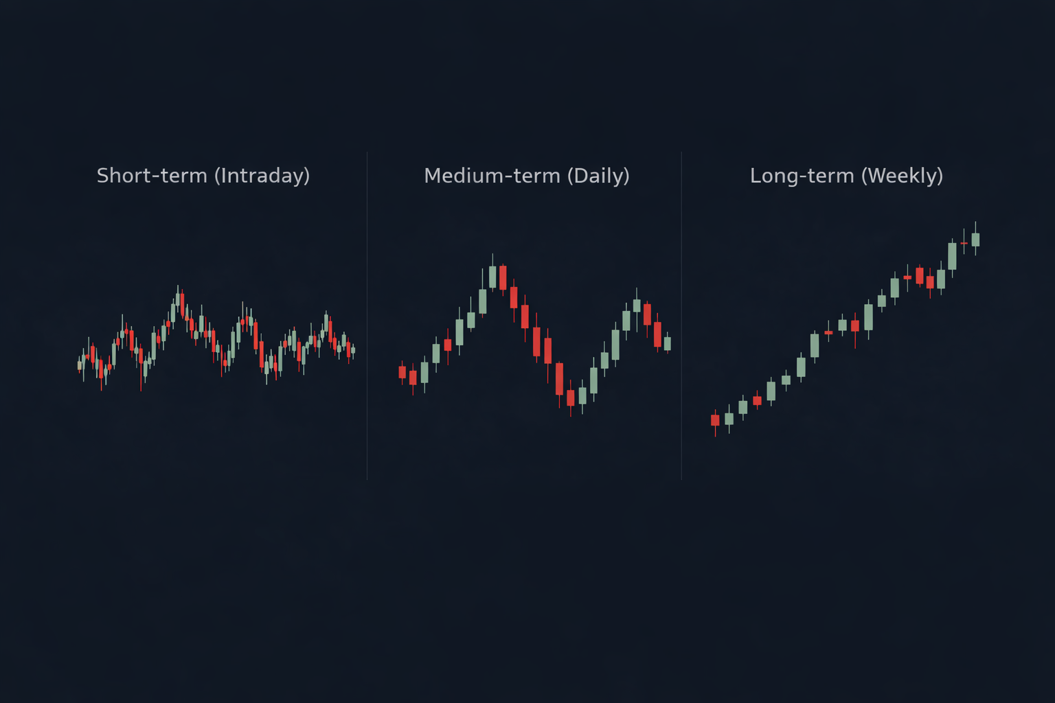
The candle body and wicks still mean the same thing — but the amount of time and participation inside them changes dramatically.
Interpreting a wick or a breakout without knowing the timeframe often leads to exaggerated conclusions.
If you have not read the foundation yet, start here: How to Read Stock Charts.
Timeframes Are Participation Lenses
A useful way to think about timeframes is this: timeframes filter participation.
Shorter timeframes tend to capture microstructure noise, news-driven reactions, short-horizon speculation, and algorithmic liquidity behavior.
Longer timeframes tend to capture broader capital flows, institutional positioning, multi-day conviction, and structural market behavior.
This is why the same pattern can look meaningful on one timeframe and irrelevant on another. You are not seeing different markets — you are seeing different layers.
Noise vs Structure: The Most Common Confusion
Many chart-reading mistakes come from treating short-term movement as if it carries long-term meaning.
Noise is not randomness. It is movement that is not meaningful at the timeframe you are trying to interpret.
A sharp move on a low timeframe can feel urgent, dramatic, and consequential — even when it disappears entirely once the chart is viewed at a broader scale.
A practical rule helps clarify this: structure is behavior that remains visible when you zoom out.
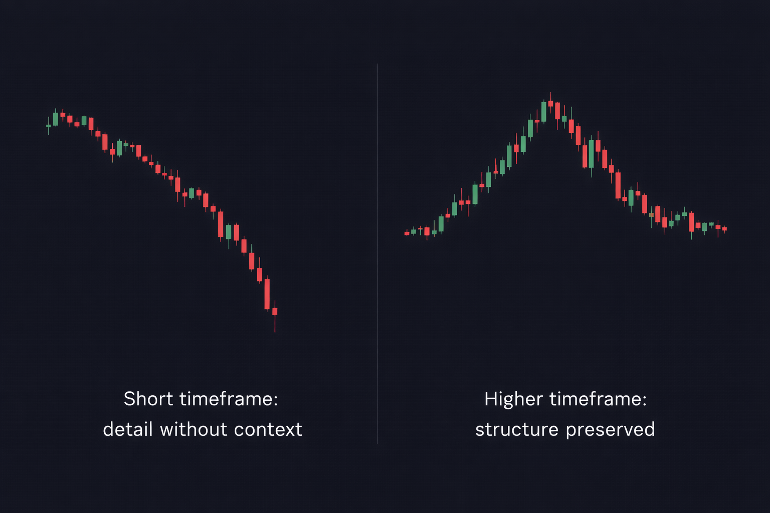
Shorter timeframes show detail. Higher timeframes define context.
Confusion arises when detail is mistaken for structure — and urgency is mistaken for importance.
This is also why trendlines are so often misread when they are drawn on short-term noise instead of higher-timeframe structure.
Why Higher Timeframes Often Carry More Weight
Higher timeframes matter not because they are more accurate, but because they compress more activity and participation into each candle.
A weekly candle can represent days of disagreement, positioning, and resolution. A one-minute candle can represent seconds of reaction.
When more participation is compressed into a single bar, the behavior it reflects tends to be more durable and less reactive.
This does not make lower timeframes useless. It means they describe detail, while higher timeframes describe context.
To keep that context visually honest, make sure you are also using the appropriate chart scale. See Linear vs Log Scale.
Problems arise when short-term movement is interpreted as if it carries long-term significance without confirming that behavior at a higher level.
Same Chart, Different Stories
A pullback that looks dramatic on a low timeframe can appear insignificant — or completely invisible — on a higher one.
Nothing changed in the market. The price data is the same. Only the timeframe used to display it has changed.
This is why two people can describe the same market in conflicting ways while both are technically correct.
What looks like a breakdown on a five-minute chart may be routine consolidation on a daily chart. What looks like acceleration on a short timeframe may be steady structure when viewed more broadly.
Many apparent contradictions in chart analysis are not disagreements about price behavior — they are differences in the lens used to observe it.
The Multi-Timeframe Habit (Without Signal-Chasing)
Using multiple timeframes does not mean searching for confirmation or stacking signals. It means building context before interpretation.
A simple habit helps anchor analysis: start with a higher timeframe to understand structure, then move lower only to observe detail.
Higher timeframes define trend, range, and major zones. Lower timeframes show how price behaves within that structure.
After examining detail, returning to the higher timeframe helps prevent overreaction to local movement that does not alter broader behavior.
The goal is orientation — not constant scanning. Multiple timeframes are used to clarify perspective, not to manufacture certainty.
Timeframes + Scale + Volume: The Context Trio
Timeframe alone rarely distorts interpretation. Problems usually arise when timeframe, scale, or volume is viewed in isolation.
Timeframe determines how much activity is compressed into each candle. Scale determines whether that activity is viewed in absolute or proportional terms. Volume shows how much participation accompanied the move.

When one of these elements is ignored, charts can appear to send conflicting or exaggerated messages that are not present in the underlying data.
This is why timeframe interpretation works best when combined with scale awareness and participation context rather than treated as a standalone setting.
Used together, timeframe, scale, and volume reduce narrative distortion and help separate structural behavior from visual noise.
Common Timeframe Mistakes
Most timeframe-related errors are not analytical failures. They are configuration oversights that quietly distort interpretation.
One of the most common mistakes is interpreting price movement without first checking what a single candle actually represents in time.
Another frequent error is treating short-term movement as structure, especially when a move looks dramatic but disappears when viewed on a higher timeframe.
Comparing charts across different timeframes without realizing it can also create false contradictions, where price appears to behave inconsistently despite following the same underlying path.
Finally, drawing conclusions before establishing timeframe context often leads to urgency-driven interpretation rather than grounded observation.
A Simple Checklist Before You Interpret Any Chart
Before drawing conclusions, a brief pause to confirm context can prevent most interpretation errors.
Start by identifying the timeframe. Ask yourself what a single candle represents and how much activity is compressed into it.
Next, confirm the scale. Determine whether price is being viewed in absolute terms or proportional terms, and whether that framing fits the horizon you are analyzing.
Zoom out before reacting. If a move only appears meaningful when viewed up close, it may be detail rather than structure.
Finally, consider participation. Ask whether volume supports broad engagement or reflects thin, short-term activity.
This checklist does not produce answers. It establishes orientation — which is what charts are best used for.
Conclusion: Timeframes as Orientation Tools
Timeframes do not change markets. They change meaning.
The same price behavior can appear urgent, dramatic, or insignificant depending on how much activity is compressed into each candle.
Understanding timeframe reduces noise, urgency, and narrative distortion. It shifts interpretation away from reaction and toward structure.
The goal of timeframe awareness is not prediction. It is orientation.
When timeframes are treated as lenses rather than signals, charts become clearer, calmer, and harder to misread.