
Learning to Read Charts Without Chasing Signals
Stock charts often look more complicated than they really are.
For many people, the first encounter with a chart — filled with candles, colors, lines, and unfamiliar terms — creates the impression that market analysis is a specialized skill reserved for professionals or insiders.
That impression is misleading.
A stock chart is simply a visual record of price movement over time. Learning to read stock charts does not promise shortcuts or certainty — but it does develop clarity. And clarity, when most participants operate on noise, is a meaningful advantage.
This guide focuses on chart literacy, not trading tactics.
This guide focuses on chart literacy — the ability to interpret price structure and context accurately. This is a skill many retail participants never develop, and one that is often underemphasized even in formal finance education.
By the end, you should be able to look at a stock chart and confidently answer:
- What am I actually looking at?
- What information does this chart show?
- What information does it not show?
This article is deliberately narrow in scope. It does not attempt to teach trading, forecasting, or financial theory. It focuses on one skill only: learning to read stock charts accurately and without distortion.
In many formal finance programs, chart reading is treated as a secondary or optional topic. Here, it is treated as a standalone literacy skill — broken down carefully, visually, and without assumptions about prior knowledge.
The goal is not to replace formal education, but to make chart interpretation clear, accessible, and grounded in how markets actually record price behavior.
The KISS Principle in Chart Reading
When approaching price charts, keeping things simple is often more effective than overcomplicating them. Many experienced market participants emphasize the KISS principle:
Keep
It
Simple,
Student
Charts like the example below are common in online commentary. While they may look impressive, they often rely on excessive lines, angles, and explanations that attempt to justify every past move.
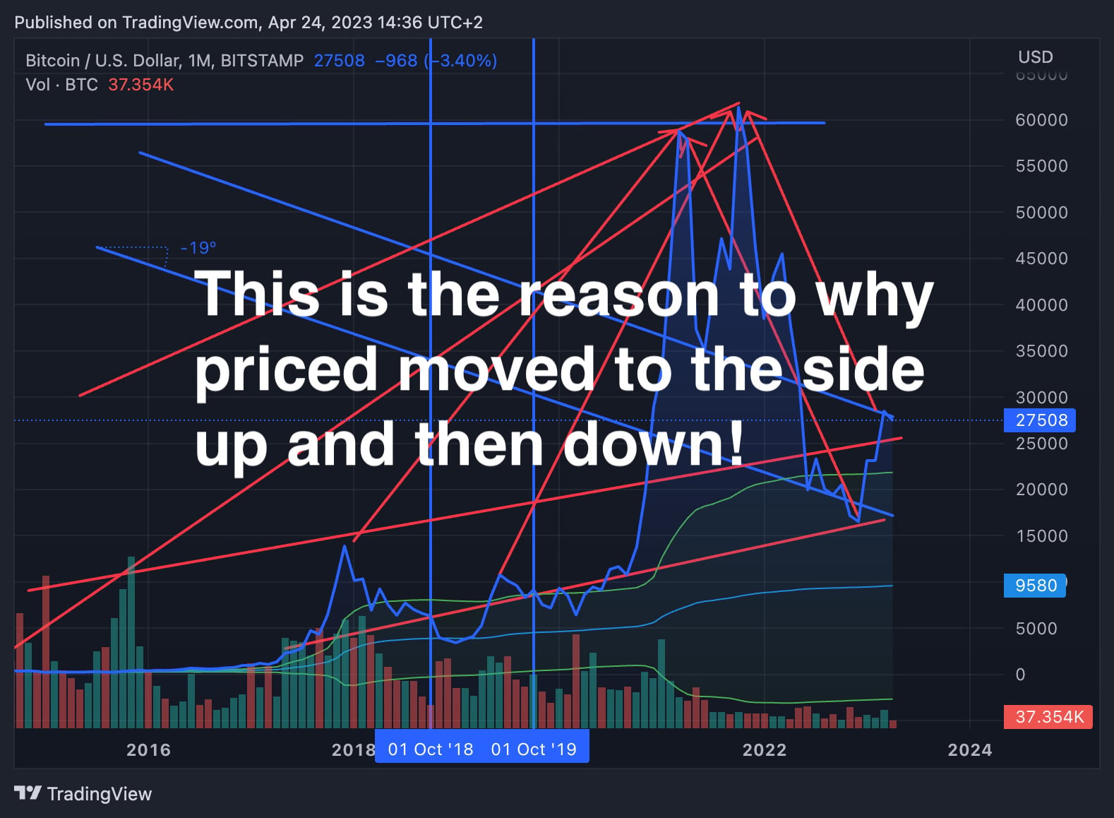
An example of over-annotated charting often seen across many markets — visually complex, but rarely more informative.
Rather than adding clarity, this kind of over-annotation usually creates confusion and a false sense of understanding.
Avoid being overwhelmed by jargon or complex indicators before you understand the basics. Good chart reading focuses on structure, not decoration.
What a Stock Chart Represents
A stock chart is not a forecast, a recommendation, or a signal generator.
At its core, a stock chart is a visual record of historical price interaction — a compressed summary of where buyers and sellers agreed to transact over time.
Every point on a chart reflects completed transactions. Every candle represents a period where supply and demand met, orders were matched, and price settled at a level both sides accepted — at least temporarily.
This distinction matters.
Charts do not tell you what will happen next with certainty. They show you what has already happened, organized in a way that makes patterns, ranges, and behavior easier for the human eye to interpret.
When you look at a stock chart, you are not seeing intention or certainty. You are seeing the aftermath of decisions made by many different participants — institutions, funds, algorithms, and individuals — all acting with different time horizons and motivations.
Because of this, charts are best understood as:
- A historical ledger of price movement
- A visual map of where activity clustered
- A way to compare behavior across timeframes
What a chart does not represent is equally important:
- It does not explain why price moved
- It does not guarantee future outcomes
- It does not distinguish between “smart” and “uninformed” trades
This is why chart literacy is about interpretation, not prediction.
Learning to read charts means learning to recognize structure, volatility, and context — not attempting to extract certainty from past movement.
Once this mental model is clear, charts become less intimidating. They stop feeling like puzzles to be solved and start functioning as reference tools that help you orient yourself within market behavior.
Understanding charts this way immediately separates observation from interpretation — a distinction that many market participants never make.
Why Charts Are Used
If stock charts do not predict the future, why are they used so widely?
Charts are used because they make complex price behavior easier to observe, compare, and contextualize. They compress thousands — sometimes millions — of individual transactions into a visual format the human brain can process quickly.
At their best, charts help answer simple but important questions:
- Where has price spent most of its time?
- How volatile has this market been?
- Is price movement expanding, contracting, or ranging?
- How does recent behavior compare to the past?
Charts are especially useful for comparison. Looking at raw prices alone makes it difficult to understand proportion, scale, or change. A chart allows you to compare:
- Different time periods of the same stock
- The same stock across multiple timeframes
- One asset’s behavior relative to another
This is why charts are used by many different participants — not just traders. Analysts, portfolio managers, researchers, and even journalists rely on charts to describe market behavior clearly and consistently.
Problems arise when charts are treated as decision engines instead of reference tools — and recognizing this distinction is one of the fastest ways to avoid the mistakes most retail participants repeat.
Charts are often misused to justify decisions after the fact, to promote certainty where none exists, or to imply precision that markets rarely offer. Lines are drawn, indicators are layered on, and narratives are built — not to understand price behavior, but to explain it in hindsight.
Used properly, charts do something far more modest — and far more valuable.
They provide orientation.
They help you understand where price is relative to where it has been, how quickly it has moved, and whether current behavior looks calm or unstable compared to the past.
This distinction becomes clearer when price movement is viewed alongside volume as a measure of participation rather than direction.
This orientation is what chart literacy is really about. Not finding signals — but developing context.
Once charts are understood this way, they stop feeling like tools for prediction and start functioning as maps that help you avoid being disoriented by short-term noise.
Common Chart Types
Stock charts all visualize the same underlying data — price over time — but they do so in different ways. The chart type you choose does not change what happened in the market; it only changes how that information is presented.
Understanding the most common chart types helps you recognize what information is being emphasized — and what is being hidden.
Line Charts
A line chart is the simplest form of price visualization. It connects a single price point from each time period, typically the closing price.
Because it ignores intraday movement, a line chart provides a clean, high-level view of overall direction. It is often used in headlines, reports, and long-term comparisons where clarity matters more than detail.
What line charts are good at:
- Showing long-term trends
- Reducing visual noise
- Comparing broad performance over time
What they hide:
- Intraday volatility
- Opening and closing behavior
- Price rejection within the period
Bar Charts
Bar charts display more information than line charts by showing four key prices for each period: open, high, low, and close.
Each bar represents one time period. A small horizontal line on the left shows the opening price, while a small horizontal line on the right shows the closing price.
Bar charts provide structural detail without the visual emphasis of color. They are commonly used by analysts who prefer precision over visual cues.
Candlestick Charts
Candlestick charts display the same open, high, low, and close data as bar charts — but in a more visual format.
Each candlestick uses a rectangular body to show the range between the opening and closing price, with thin lines (called wicks) extending above and below to show price extremes during the period.
Color is used to quickly communicate direction:
- Green (or white) candles typically indicate the price closed higher than it opened
- Red (or black) candles typically indicate the price closed lower than it opened
Candlestick charts are popular because they allow the eye to quickly scan for patterns, ranges, and changes in behavior. This does not make them predictive — but it does make them efficient for visual analysis.
Regardless of chart type, the underlying data is the same. What changes is the level of detail and the way the information is communicated.
As you move forward, candlestick charts will be the primary format we reference — not because they are superior, but because they reveal more of what happened within each period.
Understanding Candlesticks
Candlestick charts present price data in a compact visual form that highlights how price behaved within a specific time period.
Each candlestick represents a single unit of time — such as one minute, one hour, or one day — and summarizes all trading activity that occurred during that period.
Every candlestick is made up of two core components:
- The body, which shows the relationship between the opening and closing price
- The wicks, which show the highest and lowest prices reached during the period
The candle body is the most important part to understand first.
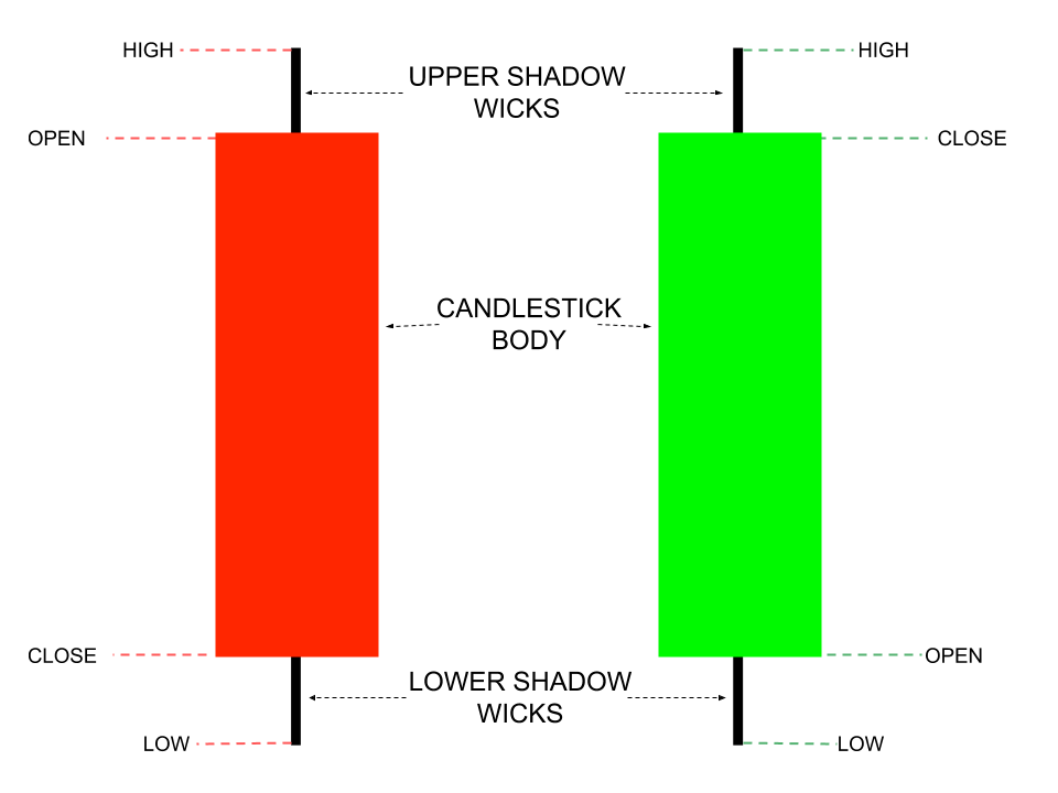
Candlestick chart showing open, close, high, and low price within a single time period
When the closing price is higher than the opening price, the candle is typically shown in green (or white). When the closing price is lower than the opening price, the candle is typically shown in red (or black).
This color coding does not imply strength or weakness on its own. It simply describes where price settled relative to where it started for that period.
In practical terms:
- A green candle means price closed higher than it opened
- A red candle means price closed lower than it opened
The length of the candle body reflects the magnitude of price change. A longer body indicates a larger difference between the opening and closing price, while a shorter body indicates a smaller change.
Importantly, candlesticks do not explain why price moved. They only show how price moved during the selected timeframe.
As you read candlestick charts, it helps to think in terms of behavior rather than prediction. Each candle represents a completed negotiation between buyers and sellers — nothing more, nothing less.
Once this foundation is clear, it becomes much easier to understand the additional details candlesticks provide, such as wicks and the role of timeframes.
Wicks and Timeframes
Once the candle body is understood, the next layer of information comes from the thin lines extending above and below it. These lines are known as wicks (sometimes called shadows).
Wicks represent price levels that were reached during the period but were not maintained by the time the candle closed. In other words, they show attempts by price to move higher or lower that ultimately failed.
Because of this, wicks are best understood as visual records of rejection rather than direction.
They answer questions such as:
- How far did price travel away from the open?
- Where did buying or selling pressure appear?
- Did price settle near the extremes or return toward the middle?
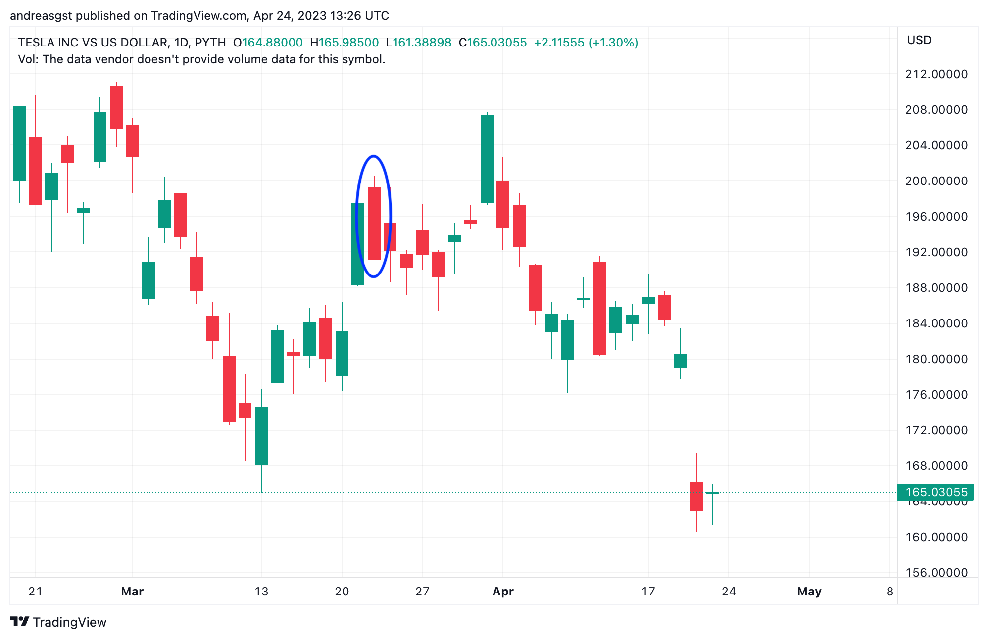
A long upper wick suggests that price moved higher during the period but encountered selling pressure that pushed it back down before close.
A long lower wick suggests that price moved lower during the period but encountered buying pressure that pushed it back up before close.
Short or absent wicks indicate that price moved in one direction with little resistance, settling near its extremes.
Wicks do not predict what will happen next. They simply describe where price was tested and rejected during that specific period.
The table below summarizes common candlestick structures and the descriptive information they contain. It is included as a reference for observation — not as a signal guide.
| Candlestick structure | What happened during the period | Standard assumption (and why it exists) | What the chart actually records |
|---|---|---|---|
| Green body, long lower wick | Price moved sharply lower intraday but closed above the open | Often assumed to signal a bullish reversal because buyers stepped in after a selloff | Lower prices were tested and rejected before the period ended |
| Green body, long upper wick | Price moved higher intraday but closed below the high | Often assumed to indicate weakness because buying failed near the highs | Higher prices were explored but not sustained into the close |
| Red body, long lower wick | Price declined and closed below the open after rebounding from lows | Sometimes assumed to mark capitulation due to visible buying at lower levels | Selling pressure dominated, but buyers absorbed part of the move |
| Red body, long upper wick | Price attempted to move higher but closed lower | Commonly assumed to be a sell signal due to rejection at higher prices | Buyers failed to maintain higher prices during the period |
| Small body, long wicks both sides | Price fluctuated widely but closed near the open | Often assumed to reflect indecision because neither side “won” | High disagreement and poor price acceptance during the period |
These descriptions only summarize the completed period; they do not imply future direction, and their weight changes by timeframe.
To interpret wicks correctly, they must always be viewed in the context of the selected timeframe.
A wick only has meaning relative to the timeframe it belongs to.
- A wick on a 1-minute chart represents seconds of rejection
- A wick on a daily chart represents hours of negotiation
- A wick on a weekly chart represents days of disagreement
This is why timeframe selection matters.
Shorter timeframes show more detail but also more noise. Longer timeframes compress activity and often provide clearer structural context.
As a general rule in market analysis, higher timeframes are often considered to carry more informational weight than lower ones — not because they are more accurate, but because they reflect broader participation.
Understanding wicks alongside timeframes helps prevent overreaction to small price movements and reinforces a more measured, contextual approach to chart reading.
Many traders react to wicks instinctively; experienced analysts evaluate them in context. That difference alone accounts for a large gap in decision quality.
Understanding the Timeframe Setting
Every candlestick represents a fixed amount of time. This time interval is not automatic — it is a setting chosen by the user.
When reading any chart, one of the most important things to check is the selected timeframe. This determines how much activity is compressed into each candle.
Misinterpretation often comes not from price itself, but from poor chart setup — which is why clean configuration and scale awareness matter before any interpretation begins.
On most charting platforms, including TradingView, the active timeframe is displayed near the top of the chart and can be changed with a single click.
If this setting is overlooked, it is easy to misunderstand what a candle actually represents.
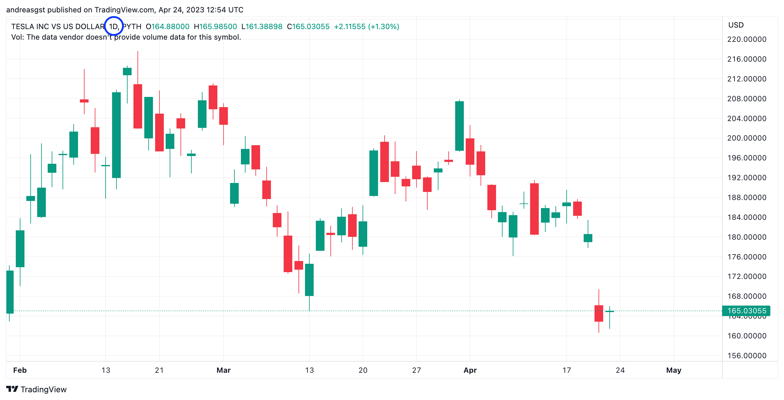
In the example above, the circled control shows the active timeframe. In this case, the chart is set to a daily timeframe (1D), meaning each candlestick represents one full trading session.
If the same chart were switched to a 1-hour or 1-minute timeframe, the candles would look visually similar — but they would represent very different amounts of activity. A daily candle compresses hours of negotiation between buyers and sellers, while a one-minute candle reflects just sixty seconds of transactions.
Because of this, the chart may appear similar at first glance, but the meaning of each candle changes completely depending on the timeframe setting.
Before interpreting any candlestick, wick, or pattern, it is essential to confirm the timeframe being used. Without this context, even technically accurate observations can lead to incorrect conclusions.
Quick recap — what you should know by now
At this point, you should be able to look at a basic stock chart and understand what it is showing — without guessing or over-interpreting.
The candle body shows direction, wicks show rejected prices, the timeframe defines scale, and the price axis anchors everything in context.
These elements describe what happened — not what must happen next.
Conceptual Support & Resistance
As you move from individual candles to broader price behavior, certain price areas begin to stand out. These areas are commonly referred to as support and resistance.
Rather than thinking of support and resistance as precise lines, it is more accurate to think of them as zones — areas where price has historically slowed, paused, or reversed due to concentrated buying or selling activity.
Support represents a zone where buying interest has previously been strong enough to prevent price from continuing lower. Resistance represents a zone where selling interest has previously been strong enough to prevent price from continuing higher.
These zones are not predictive signals. They are descriptive markers that help explain where market participants have repeatedly interacted in the past.
Support and resistance exist because markets have memory.
When price reaches an area where significant activity occurred before, participants tend to react — sometimes cautiously, sometimes aggressively — based on prior outcomes, unrealized profits, or missed opportunities.
This collective behavior can cause price to hesitate, consolidate, or reverse near familiar levels, even when no new information is present.
Importantly, support and resistance are not permanent. When price moves decisively through a zone, its role can change.
A former resistance zone may later act as support. Likewise, a former support zone may later act as resistance. This phenomenon reflects how participants reassess value once price has shifted beyond a previously accepted range.
Understanding support and resistance conceptually helps you interpret market structure without assuming certainty. These zones provide context — not instructions.
They answer questions such as:
- Where has price historically struggled to move through?
- Where has activity clustered repeatedly?
- Is price currently in familiar territory or exploring new ground?
When viewed this way, support and resistance become tools for orientation rather than prediction — helping you understand where price is relative to its own history.
Approaching support and resistance as contextual zones rather than signals reflects how price structure is evaluated in professional analysis — not how it is commonly taught in retail material — and why trendlines are best treated as contextual guides rather than precise barriers.
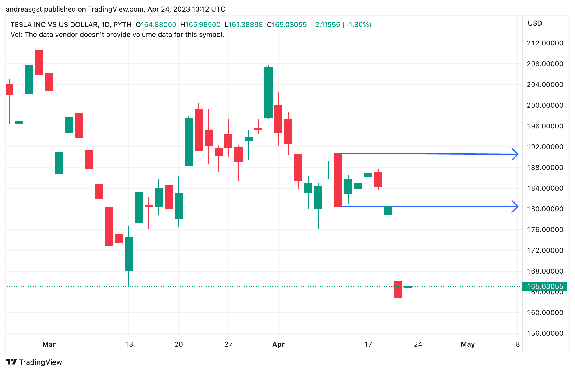
Notice that price does not stop at the exact same level each time. Instead, it slows, consolidates, or reverses within a range. This is why support and resistance are best understood as zones, not lines.
When price approaches a familiar zone, market participants often respond based on past experience — whether that means taking profits, re-entering positions, or hesitating before committing new capital.
Sometimes price moves cleanly through a zone. When this happens, the role of that area can change. A zone that previously limited upward movement may later act as a floor, while a former floor may later limit advances.
This role reversal reflects how markets reassess value once prior boundaries have been crossed. It is not a signal, but a behavioral response to shared reference points.
Reading support and resistance conceptually helps prevent overconfidence. These zones do not predict outcomes — they provide context for where price has previously encountered friction.
This broader structural context becomes especially important when interpreting individual candles and named chart patterns.
Why Candlestick “Patterns” Exist (And Why They’re Often Misused)
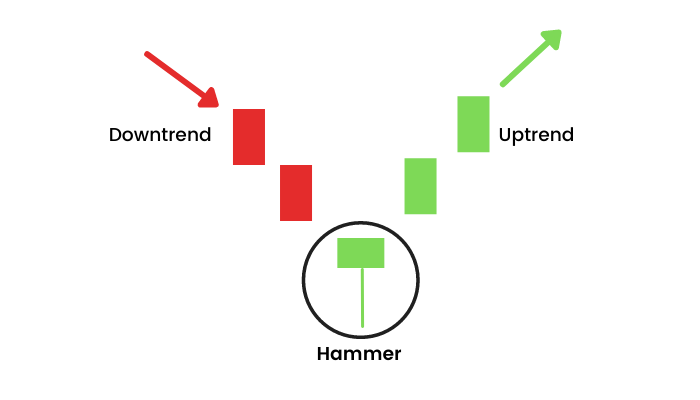
Once traders understand candlestick structure, they often encounter named “patterns” such as hammers, shooting stars, and triangles.
These patterns are not instructions or forecasts. They exist because markets are driven by human behavior, and humans tend to repeat similar actions when placed in similar conditions.
Candlestick patterns are best understood as a shared visual language used to describe how price behaved — not what it must do next.
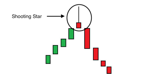
The Shooting Star: Rejection of Higher Prices
The shooting star is the structural opposite of the hammer. It appears after a period of rising prices and reflects a failed attempt to push price higher.
During the session, buyers initially pushed price upward. That advance was met with selling pressure strong enough to reverse the move before the close.
The long upper wick records that rejection. It marks where higher prices were explored — and rejected.
Like all candlestick patterns, the shooting star describes behavior. It does not confirm a reversal, nor does it guarantee future direction.
Common Misunderstandings
The following misunderstandings are common not only among beginners, but also among students encountering market charts for the first time in formal finance education. Recognizing them early helps prevent overconfidence and misinterpretation.
As charts become more familiar, it is easy to fall into patterns of thinking that feel logical but are ultimately misleading. Many of the most common mistakes in chart reading come not from lack of knowledge, but from misplaced expectations.
Charts Do Not Predict the Future
One of the most widespread misunderstandings is the belief that charts are predictive tools. While charts describe what has happened, they do not contain certainty about what will happen next.
Patterns, zones, and formations are descriptive frameworks. They help explain past behavior and provide context — they do not guarantee outcomes.
Technical analysis is sometimes described as a “self-fulfilling prophecy,” which can be misleading. In practice, price does not move because of belief alone. Markets move when real buying and selling pressure interacts with available liquidity. Widely observed levels may attract attention, but chart patterns do not cause outcomes — they record how supply and demand resolved during a specific period.
Indicators Are Not Substitutes for Understanding
Many traders attempt to compensate for uncertainty by adding indicators. While indicators can summarize information, they do not remove ambiguity.
Adding more indicators often creates the illusion of precision without improving understanding. In many cases, it simply delays decision-making or justifies decisions after the fact.
One Candle or Pattern Is Not a Signal
It is tempting to assign meaning to a single candle, wick, or shape in isolation. However, price behavior only becomes meaningful when viewed in context — across timeframes, structure, and surrounding activity.
Isolated observations without context often lead to overconfidence or reactive decisions.
Lines Are Not Exact Barriers
Support and resistance are often drawn as precise lines, but markets do not respect exact levels. Price moves in ranges, reacts imperfectly, and frequently overshoots or undershoots.
Treating these areas as zones rather than exact points helps reduce false expectations and emotional reactions.
Clarity Does Not Equal Control
Understanding charts improves orientation, not control. Being able to read a chart does not mean you can dictate outcomes or avoid uncertainty.
Chart literacy helps you ask better questions, not eliminate risk.
Recognizing these misunderstandings early makes chart reading more useful and less stressful. It shifts the goal from prediction to perspective — which is where charts provide their real value.
Practice Without Pressure
One of the advantages of learning chart literacy today is that observation does not require participation.
You do not need to place trades, take risks, or commit capital in order to study how price behaves. Charts can be explored passively — zoomed, compared, and reviewed — without making decisions in real time.
This approach removes much of the emotional pressure that often leads to rushed conclusions or overconfidence.
A useful way to practice is to:
- Scroll through historical price data and observe how price behaved around familiar zones
- Switch between timeframes to see how the same movement appears differently
- Compare calm periods to volatile ones
- Notice how often price pauses, ranges, or revisits the same areas
The goal is not to identify trades, but to build visual familiarity.
Over time, this kind of exposure helps you recognize structure and behavior without feeling the need to act on it. You begin to see charts as reference material rather than triggers.
Many charting platforms allow you to explore markets in this way using historical data or demo environments. These tools are most valuable when used for observation, not execution.
By separating learning from decision-making, you give yourself space to develop understanding without urgency — which is exactly how chart literacy is meant to be built.
Conclusion
Learning to read stock charts is not about finding certainty or gaining control over markets. It is about developing the ability to observe price behavior without distortion or urgency.
Charts do not tell stories on their own. They record activity — where price moved, where it paused, and where participants interacted. Understanding this allows you to view markets with more clarity and less emotional noise.
Throughout this guide, the focus has been on chart literacy rather than tactics:
- What a stock chart represents
- Why charts are used
- How price data is visualized
- What candlesticks, wicks, and zones describe
- What charts do not promise or predict
This perspective shifts chart reading from an exercise in guessing to a tool for orientation. It helps you understand where price is relative to its own history — not where it is supposed to go next.
When charts are approached this way, they become less intimidating and more useful. They stop functioning as signals to chase and start functioning as reference points that support informed thinking.
Chart literacy does not remove risk, but it does reduce confusion. And in markets, reducing confusion — when many participants remain reactive or misoriented — is often the most durable advantage available.
This guide is intended to improve understanding, not to provide investment advice or trading instructions. Any financial decisions should be made using appropriate risk assessment, independent judgment, and professional guidance where relevant.